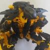
Munty Posted October 12, 2014 Share Posted October 12, 2014 Was just browsing through the 'which 2015 Toa will you buy first' Topic and saw a lot of support for Onua. His big hammer and bulky form and what not. Personally, I hate him... I think it's hands down the worst set of the initial launch, I'd rather have the KOSS (or whatever he's called now) than that ugly looking, weedy waisted, top-heavy, anime-hammered abomination... Seems like even within my own group I'm in the minority with this opinion though so was wondering what others thought. If anyone out there actually agrees or if the rest of the world sees something beautiful that I don't quite get myself! Here he is in both forms... Sorry top one is so huge, please mod it if you can! One of my biggest gripes with this guy are that hideous colour scheme. Everyone remembers Toa Mata Nui right? All those different yellows and gold as well. Eww... Seems Lego has decided early on that black and purple are a good combo for the earth faction of the relaunch though and someone had the good idea to compliment it with yellow, gold and silver too... Eww again... For the record, Kopaka and Pohatu are currently my hands down faves re. the relaunch. Tahu is cool too but I'm conflicted over Gali (mask) and Lewa (colourscheme) You know what I think about Onua... 1 Quote Check out my Bionicle store on Bricklink here!> > > Bionic Bricks < < < Let me know if you can help me find these last few collectibles!Also looking for WILD KRAATA and a VMKK Yo!!! Link to comment Share on other sites More sharing options...
Wrinkledlion X Posted October 12, 2014 Share Posted October 12, 2014 (edited) I love the new Onua. I do think it was a mistake to include silver, but I love that they're characterizing him as a strongman once again. Greg always insisted that Pohatu was the strongest Toa and Onua had average strength, but I never bought that as the original intention of the character. Loving the claws as well. And I don't see the problem with his proportions—obviously they're not realistic, but I don't mind cartoon proportions on an action figure. Edited October 12, 2014 by Wrinkledlion X 3 Quote [bloog] [brickshelf] [This used to be my library but the link is broken] Link to comment Share on other sites More sharing options...
believe victims Posted October 12, 2014 Share Posted October 12, 2014 The yellow is the unfortunate result of wanting the play features to pop out. I personally prefer it to the red they usually use, but that's just me. The silver is unfortunate, and I wish his shoulder pads were gold instead, because if he had a color scheme of black, purple, and gold, he'd have the color scheme of the best LEGO set in existence. I think it's harsh to compare this color scheme to Toa Mata Nui, though. TMN had a bunch of colors similar enough to seem redundant, but different enough to clash, which is part of what made it so horrible. Meanwhile, Onua has some thought put into his colors. The silver is the only thing that really detracts from it; otherwise, he's got a fairly consistent and well-spread color scheme. I'm surprised the color scheme is your biggest gripe, considering my biggest complaint is that once again, a set that uses the Hulk torso piece fails to fill out behind it properly, thus turning his MEATY PECS into a mere facade. That being said, I love him, despite those flaws. His mask is easily one of the most evocative of the original and his chest patterning carries patterns from his mask to his chest, making his aesthetic more consistent. 3 Quote Link to comment Share on other sites More sharing options...
Ragnar Lothbrok Posted October 12, 2014 Share Posted October 12, 2014 (edited) My only problem with Onua is the trans-purple limbs. They are nice but completely throw the colour scheme. Still, nice to see. The silver upper torso pieces could be black or gold, too. I'll be modding him but I prefer him over Tahu, who I find kinda boring. EDIT: I agree with Lucina. That Hulk torso is really poor yet again. Edited October 12, 2014 by Gathered Friends Quote Twitter: @enkindle_this Link to comment Share on other sites More sharing options...
Lyichir Posted October 12, 2014 Share Posted October 12, 2014 New Onua is lovely. I'm very pleased that the new Toa don't all share the same physique, with Onua being short and stocky, Pohatu being small and speedy (like many runners), Tahu being tall and heroic, Lewa being tall and gangly, and Kopaka being tall and bulky. It creates a more diverse and interesting-looking team than any Toa team from the past. 2 Quote Formerly Lyichir: Rachira of Influence Aanchir's and Meiko's brother Link to comment Share on other sites More sharing options...
Munty Posted October 12, 2014 Author Share Posted October 12, 2014 You know others in my group agree about the mask being faithful to the originals but I still really don't see it myself... I guess it's difficult to say without seeing the real thing though. I get that the yellow is for the moving parts like the red was. I got used to the red but then it was usually fairly well concealed in titan sets. To have it sticking right out of the model is very strange. Similar in ways to the mechanism in the Toa Mata but at least they were just grey so they blended in somewhat and weren't so over-stated. I don't see the attraction of those 'claws' either. They look more like shovels to me, and that's only in 'adrenaline mode' (bleurgh...) anyway as the normal Onua has wimpy little hands... Lame.New Onua is lovely. I'm very pleased that the new Toa don't all share the same physique, with Onua being short and stocky, Pohatu being small and speedy (like many runners), Tahu being tall and heroic, Lewa being tall and gangly, and Kopaka being tall and bulky. It creates a more diverse and interesting-looking team than any Toa team from the past. Agreed (mostly anyway ) It's really great to see them with such variation. It almost makes up for the somewhat cookie-cuttered protectors... It doesn't, but almost! Quote Check out my Bionicle store on Bricklink here!> > > Bionic Bricks < < < Let me know if you can help me find these last few collectibles!Also looking for WILD KRAATA and a VMKK Yo!!! Link to comment Share on other sites More sharing options...
Flex Lord Splash Posted October 12, 2014 Share Posted October 12, 2014 I like the new Onua. Plus it looks like his old mask is on his chest which I find kinda cool. Quote BZP-RPG Profiles Marvel Profiles Link to comment Share on other sites More sharing options...
UngluedBike Posted October 12, 2014 Share Posted October 12, 2014 I actually like the trans-purple limbs. Looks like you are truly in the minority buddy 1 Quote Also, if you're a resident of the UK and like Bionicle, go ahead and join us at this awesome Facebook group: https://www.facebook.com/groups/BFUK7/ Link to comment Share on other sites More sharing options...
Toa Smoke Monster Posted October 12, 2014 Share Posted October 12, 2014 I also like the new Onua. I actually think that his color scheme, even with the silver, looks really good. His weapon also very well done IMO. He won't be the first Toa I purchase, but I probaby will get him at some point once the new sets are released. Quote Everyone is one choice away from being the bad guy in another person's story. Link to comment Share on other sites More sharing options...
bioniclepluslotr Posted October 12, 2014 Share Posted October 12, 2014 I thought black and purple were original colors of the Earth tribes in the original series. There were Matoran with purple masks. Quote Link to comment Share on other sites More sharing options...
Constructelf Posted October 12, 2014 Share Posted October 12, 2014 The first time I looked at Onua, I went like "dude, lose some weight". In all seriousness, I can see where you're coming from. He looks really unbalanced. Maybe he walks on all on all fours in the claw form. The hammer just looks silly though. Quote Link to comment Share on other sites More sharing options...
Manducus Posted October 12, 2014 Share Posted October 12, 2014 One thing I don't like about 2015 Onua: He's not hunched. Quote Link to comment Share on other sites More sharing options...
MrStoneEdge Posted October 12, 2014 Share Posted October 12, 2014 I believe Onua would look better with golden shoulder pads. The transparent limbs look blue in the second picture and he would look better without them. All the sets would look better with gears in a more neutral color instead of the yellow one they have. I like the size of him though. It is fitting for him to have a bulky build. Quote Link to comment Share on other sites More sharing options...
bonesiii Posted October 12, 2014 Share Posted October 12, 2014 I'm actually torn on Onua. I like the idea of a bulkier-than-others Onua. I always felt that was sort of implied in the original for some odd reason, and have portrayed him that way in some fanfics (unrelated to canon). And I love those metallic pieces. The color scheme doesn't really work for me, though, for some reason. I think I would like that exact same combo of colors in that amount for him better if they were spread out more consistently. As it is, they're too focused in just a few spots, and are big in those spots, so it feels like "random colors MOCs" (like really little kids tend to make, yanno?), something that has always bugged me. On the other hand it can add some realism value. Not everything in life has a perfectly artistic color scheme. Makes him seem kind of like a practical machine, which does fit his personality. 1 Quote The Destiny of Bionicle (chronological retelling of Bionicle original series, 9 PDFs of 10 chapters each on Google Drive): Part 1 - Warring with Fate | Part 2 - Year of Change | Part 3 - The Exploration Trap | Part 4 - Rise of the Warlords | Part 5 - A Busy Matoran | Part 6 - The Dark Time | Part 7 - Proving Grounds | Part 8 - A Rude Awakening | Part 9 - The Battle of Giants My Bionicle Fanfiction (Google Drive folder, eventually planned to have PDFs of all of it) Link to comment Share on other sites More sharing options...
believe victims Posted October 12, 2014 Share Posted October 12, 2014 I believe Onua would look better with golden shoulder pads Oddly enough, I just 'shopped this very thing. I definitely think it's an improvement, though I can understand why they wouldn't mold one piece in two colors if it's only going to appear in one set. 1 Quote Link to comment Share on other sites More sharing options...
xccj Posted October 12, 2014 Share Posted October 12, 2014 Personally, I'm glad to see him with purple as a secondary color. Bionicle was always in short supply of purple after 2001's Onepu and Nui-Jaga, which was disappointing because the MNOLG made purple one of the main Earth colors. It's made some appearanced in Hero factory, but seeing purple return with Onua is great, both as a return to classic roots and as a boost in color usage. The same goes with the trans purple. (Gosh, I remember back in the day when we were holding out for a purple Toa... who never appeared.) The gold and silver is a bit much. Honestly, I would go with more silver myself. The gold highlights work with the purple, but it pulls too much attention away from Onua's true primary color, black. Silver is more toned down and I feed would work better with black and purple, moreso than with other colors. Including both silver and gold does make it look a bit cluttered color wise, but I don't think they make that gold armor piece in any other color, just like with the silver claw/shovel pieces, so that might be part of their reasoning. And, IMO, I always saw Onua and Pohatu as being about equal in strength, with Pohatu maybe being a bit stronger naturally but Onua getting a big boost from his mask that makes him stronger overall. Quote My BZPower Stories Dark Core--Kulagi's Kanoka--A Shadow's Contrivance--Mystery on Keli-Nui--BZ-Koro: To Bring Back Bionicle Link to comment Share on other sites More sharing options...
Pomegranate Posted October 12, 2014 Share Posted October 12, 2014 I don't like how his armor is just some very, very large pieces all tacked on to him. The chest and shoulder armor just look... I dunno, it looks off to me. Like it's just way too big, and too flat at that. I think it might just be the promotional images, though, cause I liked him a lot more when I saw the set in person. I think we need to seem him standing together with the rest of the Toa for a proper comparison. Quote . Link to comment Share on other sites More sharing options...
believe victims Posted October 12, 2014 Share Posted October 12, 2014 The gold and silver is a bit much. Honestly, I would go with more silver myself. The gold highlights work with the purple, but it pulls too much attention away from Onua's true primary color, black. Silver is more toned down and I feed would work better with black and purple, moreso than with other colors. Including both silver and gold does make it look a bit cluttered color wise, but I don't think they make that gold armor piece in any other color, just like with the silver claw/shovel pieces, so that might be part of their reasoning. Actually, that armor piece comes in both silver and white in addition to gold. He has gold because all three of the larger Toa have gold. Quote Link to comment Share on other sites More sharing options...
bioniclepluslotr Posted October 12, 2014 Share Posted October 12, 2014 What if they replaced black with purple sets? Quote Link to comment Share on other sites More sharing options...
Lyichir Posted October 12, 2014 Share Posted October 12, 2014 I believe Onua would look better with golden shoulder pads Oddly enough, I just 'shopped this very thing. I definitely think it's an improvement, though I can understand why they wouldn't mold one piece in two colors if it's only going to appear in one set. Well, the alternative is to replace his gold parts with silver ones. That IS an easy change, since several of the sets use that same detail element in silver. And I think it might actually look better—the mass of gold that gold shoulder pads would give him seems a bit over-the-top. I imagine the main reason he used gold for those was to help justify his higher price point. Despite being the biggest set with the highest piece count (and arguably some of the most complexity), I can imagine a lot of kids passing him up in favor of the shiny gold on Kopaka and Tahu. I don't think the clashing colors ruin his appearance, but I do think it'd be worth trying to replace the gold elements to see how he looks without them. Quote Formerly Lyichir: Rachira of Influence Aanchir's and Meiko's brother Link to comment Share on other sites More sharing options...
Wrinkledlion X Posted October 12, 2014 Share Posted October 12, 2014 Personally, I'm glad to see him with purple as a secondary color. Bionicle was always in short supply of purple after 2001's Onepu and Nui-Jaga, which was disappointing because the MNOLG made purple one of the main Earth colors. It's made some appearanced in Hero factory, but seeing purple return with Onua is great, both as a return to classic roots and as a boost in color usage. The same goes with the trans purple. (Gosh, I remember back in the day when we were holding out for a purple Toa... who never appeared.) The gold and silver is a bit much. Honestly, I would go with more silver myself. The gold highlights work with the purple, but it pulls too much attention away from Onua's true primary color, black. Silver is more toned down and I feed would work better with black and purple, moreso than with other colors. Including both silver and gold does make it look a bit cluttered color wise, but I don't think they make that gold armor piece in any other color, just like with the silver claw/shovel pieces, so that might be part of their reasoning. And, IMO, I always saw Onua and Pohatu as being about equal in strength, with Pohatu maybe being a bit stronger naturally but Onua getting a big boost from his mask that makes him stronger overall. I always assumed Onua was the big, upper-body-strength strongman-type, whereas Pohatu was the lower-body-strength athlete type. It seemed implied to me from early on, what with Pohatu's kicking-tools and Onua's digging claws. I just didn't like that Pohatu was significantly stronger after they both had their own Pakaris—it made Onua's Pakari seem redundant somehow. Quote [bloog] [brickshelf] [This used to be my library but the link is broken] Link to comment Share on other sites More sharing options...
BioniCro Posted October 12, 2014 Share Posted October 12, 2014 I love the new Onua. The mask is good (not great though), the new armor and build is fitting, I love how he has the same price with Kopaka and Tahu, yet looks so much bigger. I love the hammer and the purple pieces as well as the new shoulder armor parts. I also love the new Pohatu, though I am not too crazy about Boomerangs or blue Rakshi tool, however I love orange brown color and his mask (maybe my favorite new kanohi design). I always felt both Onua and Pohatu were the havy hitters of the team, but where Onua was wise and mighty, I felt Pohatu was pure energy mixed with strenght. Onua would be thoughtful and wise, while Pohatu would be hands on, rush in, kinda guy. Quote Link to comment Share on other sites More sharing options...
Pohatu: Uniter of Stone Posted October 12, 2014 Share Posted October 12, 2014 I actually like the trans-purple limbs. Looks like you are truly in the minority buddy If they don't like trans-purple, they must be joking. Quote I HATE SCORPIOS ~Pohatu Master of Stone, 2015 Link to comment Share on other sites More sharing options...
MrStoneEdge Posted October 12, 2014 Share Posted October 12, 2014 I believe Onua would look better with golden shoulder pads Oddly enough, I just 'shopped this very thing. I definitely think it's an improvement, though I can understand why they wouldn't mold one piece in two colors if it's only going to appear in one set. Now I think he would look better with gold claws. Nice picture! Quote Link to comment Share on other sites More sharing options...
bioniclepluslotr Posted October 12, 2014 Share Posted October 12, 2014 I always thought Onua was supposed to be the small Toa. Quote Link to comment Share on other sites More sharing options...
randomreviewerbros Posted October 12, 2014 Share Posted October 12, 2014 I personally think he looks really great, everything about the design is aesthetically pleasing, the gold highlights make him look all the more better Quote Go check out our Youtube channel! We review BIONICLE and other LEGO related items! https://www.youtube.com/user/RandomReviewerBros Link to comment Share on other sites More sharing options...
Munty Posted October 12, 2014 Author Share Posted October 12, 2014 Oddly enough, I just 'shopped this very thing. I definitely think it's an improvement, though I can understand why they wouldn't mold one piece in two colors if it's only going to appear in one set. Any chance of a few more shopped pics Lucina? Maybe try losing all the gold in favour of silver as it's already been said that those parts are available in silver. If it looks good I may even bricklink them for the release date so I don't have to spend money on a set that looks so wierd! Another good one would be to make those 4 purple pieces black (if they're available in that colour!) Maybe show us how it would look with ZERO gold and purple. I might build that set myself if it looks good... Regarding Pohatu v Onua comments I have always been of the opinion that Pohatu was quick and agile while Onua was big and strong as said by others. Who said that Pohatu was the strongest one? Greg? Not writer Greg? I mean, that doesn't quite make it canon but still... It's Greg! I also agree with comments that Onua should have that hunched appearance he used to have but he doesn't really seem to. He's got the ridiculously huge torso but his head sits on top of it like all the other Toa. But then, I have an Onua Mistika sat in front of me and to be fair it looks absolutely NOTHING like the original Mata set... I like it, but it doesn't look like Onua at all! Quote Check out my Bionicle store on Bricklink here!> > > Bionic Bricks < < < Let me know if you can help me find these last few collectibles!Also looking for WILD KRAATA and a VMKK Yo!!! Link to comment Share on other sites More sharing options...
MrStoneEdge Posted October 12, 2014 Share Posted October 12, 2014 Oddly enough, I just 'shopped this very thing. I definitely think it's an improvement, though I can understand why they wouldn't mold one piece in two colors if it's only going to appear in one set. Any chance of a few more shopped pics Lucina? Maybe try losing all the gold in favour of silver as it's already been said that those parts are available in silver. If it looks good I may even bricklink them for the release date so I don't have to spend money on a set that looks so wierd! Another good one would be to make those 4 purple pieces black (if they're available in that colour!) Maybe show us how it would look with ZERO gold and purple. I might build that set myself if it looks good... Regarding Pohatu v Onua comments I have always been of the opinion that Pohatu was quick and agile while Onua was big and strong as said by others. Who said that Pohatu was the strongest one? Greg? Not writer Greg? I mean, that doesn't quite make it canon but still... It's Greg! I also agree with comments that Onua should have that hunched appearance he used to have but he doesn't really seem to. He's got the ridiculously huge torso but his head sits on top of it like all the other Toa. But then, I have an Onua Mistika sat in front of me and to be fair it looks absolutely NOTHING like the original Mata set... I like it, but it doesn't look like Onua at all! I had a thought that he might look better in all silver armor or all gold armor instead of having armor of both colors. And – while nice – I don't think that the transparent purple pieces look good on him. Solid purple or black (or maybe even gray) would look better. But of course the set might look better in real life. Quote Link to comment Share on other sites More sharing options...
Pohatu: Uniter of Stone Posted October 12, 2014 Share Posted October 12, 2014 Oddly enough, I just 'shopped this very thing. I definitely think it's an improvement, though I can understand why they wouldn't mold one piece in two colors if it's only going to appear in one set. Any chance of a few more shopped pics Lucina? Maybe try losing all the gold in favour of silver as it's already been said that those parts are available in silver. If it looks good I may even bricklink them for the release date so I don't have to spend money on a set that looks so wierd! Another good one would be to make those 4 purple pieces black (if they're available in that colour!) Maybe show us how it would look with ZERO gold and purple. I might build that set myself if it looks good... Regarding Pohatu v Onua comments I have always been of the opinion that Pohatu was quick and agile while Onua was big and strong as said by others. Who said that Pohatu was the strongest one? Greg? Not writer Greg? I mean, that doesn't quite make it canon but still... It's Greg! I also agree with comments that Onua should have that hunched appearance he used to have but he doesn't really seem to. He's got the ridiculously huge torso but his head sits on top of it like all the other Toa. But then, I have an Onua Mistika sat in front of me and to be fair it looks absolutely NOTHING like the original Mata set... I like it, but it doesn't look like Onua at all! I had a thought that he might look better in all silver armor or all gold armor instead of having armor of both colors. And – while nice – I don't think that the transparent purple pieces look good on him. Solid purple or black (or maybe even gray) would look better. But of course the set might look better in real life. Just the fact that the set comes with Trans Purple should be enough to like it. Quote I HATE SCORPIOS ~Pohatu Master of Stone, 2015 Link to comment Share on other sites More sharing options...
Dralcax Posted October 12, 2014 Share Posted October 12, 2014 The gold and silver is a little annoying, but my biggest gripe is how excessively wide his shoulders are. They're much wider than the Hulk chestplate, and it just looks ridiculous. Also, the claws look kinda derpy, yeah they make a hammer, but I would prefer them to look more like claws and not flipped-over shovels. Quote Link to comment Share on other sites More sharing options...
Reya Posted October 12, 2014 Share Posted October 12, 2014 The gold and silver is a little annoying, but my biggest gripe is how excessively wide his shoulders are. They're much wider than the Hulk chestplate, and it just looks ridiculous. Also, the claws look kinda derpy, yeah they make a hammer, but I would prefer them to look more like claws and not flipped-over shovels.I agree with this wholeheartedly. While I support the idea of making Onua appear like the strongest Master, I think the proportions are a bit off. Quote Link to comment Share on other sites More sharing options...
believe victims Posted October 12, 2014 Share Posted October 12, 2014 Any chance of a few more shopped pics Lucina? Maybe try losing all the gold in favour of silver as it's already been said that those parts are available in silver. If it looks good I may even bricklink them for the release date so I don't have to spend money on a set that looks so wierd! Another good one would be to make those 4 purple pieces black (if they're available in that colour!) Maybe show us how it would look with ZERO gold and purple. I might build that set myself if it looks good... (apologies for some traces of gold) definitely makes for a subtler look. not bad. I prefer gold because lunar limo but silver onua is definitely an okay look. I can't say i'd be optimistic about making the purple black; then he would be monochromatic. I always prefer a black color scheme to have a bright highlight color. 5 Quote Link to comment Share on other sites More sharing options...
MrStoneEdge Posted October 12, 2014 Share Posted October 12, 2014 Any chance of a few more shopped pics Lucina? Maybe try losing all the gold in favour of silver as it's already been said that those parts are available in silver. If it looks good I may even bricklink them for the release date so I don't have to spend money on a set that looks so wierd! Another good one would be to make those 4 purple pieces black (if they're available in that colour!) Maybe show us how it would look with ZERO gold and purple. I might build that set myself if it looks good... (apologies for some traces of gold) definitely makes for a subtler look. not bad. I prefer gold because lunar limo but silver onua is definitely an okay look. I can't say i'd be optimistic about making the purple black; then he would be monochromatic. I always prefer a black color scheme to have a bright highlight color. The transparent purple pieces look better with the silver armor. He's got a more futuristic sci-fi look now thanks to all the silver and the transparency goes better with that. Quote Link to comment Share on other sites More sharing options...
Wrinkledlion X Posted October 12, 2014 Share Posted October 12, 2014 (edited) Any chance of a few more shopped pics Lucina? Maybe try losing all the gold in favour of silver as it's already been said that those parts are available in silver. If it looks good I may even bricklink them for the release date so I don't have to spend money on a set that looks so wierd! Another good one would be to make those 4 purple pieces black (if they're available in that colour!) Maybe show us how it would look with ZERO gold and purple. I might build that set myself if it looks good... (apologies for some traces of gold) definitely makes for a subtler look. not bad. I prefer gold because lunar limo but silver onua is definitely an okay look. I can't say i'd be optimistic about making the purple black; then he would be monochromatic. I always prefer a black color scheme to have a bright highlight color. Hmm. He looks kind of nondescript with just silver... What if we replaced the silver with black, and left the gold?(That may be beyond the power of a quick-and-easy Photoshop, I dunno) Edited October 12, 2014 by Wrinkledlion X Quote [bloog] [brickshelf] [This used to be my library but the link is broken] Link to comment Share on other sites More sharing options...
Munty Posted October 12, 2014 Author Share Posted October 12, 2014 (apologies for some traces of gold) definitely makes for a subtler look. not bad. I prefer gold because lunar limo but silver onua is definitely an okay look. I can't say i'd be optimistic about making the purple black; then he would be monochromatic. I always prefer a black color scheme to have a bright highlight color. That looks a lot better I think... It looked better with the gold shoulders and still silver weapons anyway, armour should all be the same colour but weps don't necessarily need to match armour. I think taking the gold out completely is a better look imo though. And while changing the purple for black may make him a little TOO colourless I'd still be interested in seeing it... That said I think the silver highlights the purple colour SO much better than the gold did. So maybe I should stop complaining about the purple so much and just hate the gold more!!! I'll consider buying those parts in silver in preparation for the New Year releases I think... Thanks for taking the time to do the shop Lucina!Hey any chance of doing the same thing with the other photo too? One with the gold shoulders added and another with all gold made silver? The gold and silver is a bit much. Honestly, I would go with more silver myself. The gold highlights work with the purple, but it pulls too much attention away from Onua's true primary color, black. Silver is more toned down and I feed would work better with black and purple, moreso than with other colors. Including both silver and gold does make it look a bit cluttered color wise, but I don't think they make that gold armor piece in any other color, just like with the silver claw/shovel pieces, so that might be part of their reasoning. Actually, that armor piece comes in both silver and white in addition to gold. He has gold because all three of the larger Toa have gold. Can anyone lead me towards this piece? No idea what sets it would be in so an idea of where to look would be great. A part number would be even better! Quote Check out my Bionicle store on Bricklink here!> > > Bionic Bricks < < < Let me know if you can help me find these last few collectibles!Also looking for WILD KRAATA and a VMKK Yo!!! Link to comment Share on other sites More sharing options...
Nidhiki of the Shadows Posted October 12, 2014 Share Posted October 12, 2014 (edited) I don't mind Onua at all. Although I think his top half is way too much bigger than his lower half, the stature is reminiscent of Mata Nui-era in that he is shorter and bulkier. The design seems quite creative and the weapon is great. As for the colour scheme, the yellow is only there to draw the buyers attention to the action function. It's not really a part of the colour scheme. But yes, I agree with the silver. Gold, Purple and Black would have been great colours on their own but the silver shoulder plates just make it look a little messier than it should be. -NotS Edited October 12, 2014 by Nidhiki of the Shadows Quote Link to comment Share on other sites More sharing options...
Banana Gunz Posted October 12, 2014 Share Posted October 12, 2014 I got to see Onua in real life, and I can say that he looks fantastic, and might be one of my favorites. He has a strong, solid design that works very well. My main guess for why people don't like the new Onua is because he was made super stocky and large. I can see why people might think this is a little far from his original forms, but I like it. It takes the aspect of him being hunchbacked stocky and emphasizes it. His color scheme wasn't a real problem for me. Although the gold would look better if it were the same color as his shoulder plates, I oddly didn't find it an issue. Trust me, the online picture look cool, but they don't do the sets complete justice. Seeing sets in person gives a whole other perspective on them. Onua's design works despite what a change it might be. Quote tumblr: it's a lovely place to be if you've gone madflickr: mah yummy gross pics mmmPew Pew Pew Pew Pew Link to comment Share on other sites More sharing options...
dotcom Posted October 12, 2014 Share Posted October 12, 2014 I like Onua as a design, the set is pretty alright. The mask is one of the better ones. The color scheme is definitely very messy, though. Replacing all the gold with silver looks good, but I also think gunmetal could be effective? Though it would kinda make him even more monochromatic. Shrugs. The trans purple looks really weird in these pictures, but I think it's just the cgi making it clash more. I would hope. Quote Link to comment Share on other sites More sharing options...
Latrodectus Posted October 12, 2014 Share Posted October 12, 2014 I do think the mix from silver and gold is annoying, but black and purple look great and I love his bulkier shape. The warhammer and claws are great weapons that perfectly suit the character. One thing I've concerned about with the bigger sets is that they don't seem much larger and more complex than the medium-sized sets... At least, I don't see a five dollars difference. Quote Link to comment Share on other sites More sharing options...
Lyichir Posted October 12, 2014 Share Posted October 12, 2014 I like Onua as a design, the set is pretty alright. The mask is one of the better ones. The color scheme is definitely very messy, though. Replacing all the gold with silver looks good, but I also think gunmetal could be effective? Though it would kinda make him even more monochromatic. Shrugs. The trans purple looks really weird in these pictures, but I think it's just the cgi making it clash more. I would hope. The trans purple is definitely an odd color. In a lot of lighting, when it has a shell on it, it can be almost indistinguishable from an ordinary black bone. In the right light at the right angles, though, the color becomes quite apparent. Quote Formerly Lyichir: Rachira of Influence Aanchir's and Meiko's brother Link to comment Share on other sites More sharing options...

Recommended Posts
Join the conversation
You can post now and register later. If you have an account, sign in now to post with your account.
Note: Your post will require moderator approval before it will be visible.