-
Posts
1,592 -
Joined
-
Last visited
-
Days Won
7
Content Type
Profiles
Forums
Gallery
Events
Blogs
Store
Raffles
Blog Comments posted by Soran
-
-
something seems off about Sumiki... It must be the accent.
-
Happy Birthday(?) and congratulations on becoming an AFOL.
-
There are several font download sites out there. I doubt it might have the font you're looking for though, but who knows.
-
I like how realistic this actually is, pretty much dumbs it down. Actually if you really wanted to sum it up you should've put "Copy and pasted by (name)" since that is pretty much everyone's view of the comic forum.
I think my favorite two are Akano and Gerlicky, I think you nailed them.
Is the kit an upgrade of the vortex kit or just a random one? Looks razor'ish.
~Soran
-
I really like the blurred with text one. I thought they all looked good, but I really liked the blurred with text one. Might I ask who your banner is suggesting? Is it Matoro or that one person from Toa Jovan's who suffered the same fate as Matoro, or just someone else entirely? Either way they all look extremely well done, I'm surprised at how amazing they all look. Awesome work.
~Soran
-
I don't think my favorite is suitable for bzpower...
-
Of course I think a random drawing is a bit bland. You sure you don't want to host a battle to the death?
I totally agree to this. And to quote possibly one of my favorite quotes from -Windrider- (He says the best things ever), "If you're suggesting that we tape the entries to our faces and enact a battle royal to see who is the victor, then we are definitely doing that!"
Man I was so confused when I saw the entry. All I read was 'pmship giveaway' and I saw my name and I was rocking out... Then I noticed it was an entry list...
...
._.
Anyway, best of luck to the other entrants and I can't wait for the battle royal. I shall be victorious.
~Soran
-
We need a VahkiPower skin.
'Nuff said.
I totally agree with this.
I like the skin although the red just catches the eyes a little too much in my opinion. I get easily distracted by it so it makes me forget what I was reading. I doubt its the color though, it might just be because I'm not completely use to it yet.
I also feel that Takua in the blogs is a little cool but also a little odd. The way he stands near the title and description of the blogs at the top is pretty cool but at the same time it also makes the blog seem a little serious because of his serious 'come at me bro' body language. I've seen quite a few blogs with humorous names which I find entertaining, but when you add an overly serious takua to it, it just sucks out any possible emotion that was suppose to come from the name. I know it isn't really a big deal and that he was put there to since he is the chronicler and a blog is a chronicle of your life and so on, but I think it just feel that its very plain. Might I suggest changeable premade images of other Bionicle characters or the possibility of having Takua become the default icon of the person's specific blog and have it changeable like an avatar. I know this sounds really unnecessary but still its nice to consider ideas even though they might sound very worthless.
I will commend you on the new quote box as well as that fancy blue color. I actually really like the color choices (red is a little too eye catching as I said before though), they work well with eachother and give a awesome new look to the place. Very awesome. The quote boxes are also pretty spiffy if I do say so myself. In total this was an awesome update and although I personally have some tiny issues with it, I feel that it is still magnificent in appearance. Really gives it that new site smell.
~Soran
-
Well it all depends on the people. Some people enjoy being around people such as yourself for a number of reasons. It might not be because you're a likable person, its probably just because your funny or entertaining. Not in the joking kind of way but just the entertainment factor, like sitcoms.
~Soran
-
Well please do. ._.
-
Eh, I'll test my luck. Sign me up.
-
Looks epic, although there area a few things that look a little odd in my opinion. For some reason, the design of the arms just don't really look right. There doesn't really seem to be anything that seperates the lower arm and the upper arm. It just looks a little odd without something that separates it. Rest of the body looks nice, I especially like the torso and legs. I wouldn't worry abut the mask, the mask looks like he was stuck in a matoran sphere and tossed around a lot, so it looks realistic. In my opinion, it helps show the struggles he might have.
Anyway, great job on the drawing, it looks awesome.
~Soran
-
Needs moar matching robe and pipe.
-
Totally awesome. I'm probably going to use the sprites in future comics. I already have some ideas for them.
-
Looks great!
Too great infact... Suspicious...
-
Welcome Back ol' chap.
-
Give us the deets.
-
Dat helmet.
The drawing looks quite nice. His expression is spot on and I can just imagine his voice while saying that. He probably is trying to go for a deep, hero voice when saying that. I'm not sure if the shoulder armor is suppose to be similar or not, but if it isn't then thats awesome. If it was then well its still awesome. Chainmale looks a little rushed though, but I can totally understand that. I tried to make a chainmale once, I think I gave up halfway through. Too much chain. Oh, also the helmet is heroic looking.
~Soran
-
Heres what I do for my drawings. I use to draw a lot of sci-fi, from vehicles to power suits, to whatever. I drew enough that I created my own little story. Basically I just took the mini story I made up and drew whatever was in it, sometimes even repeating drawings, just in different angles.
-
Well thats a convenient hobby.
I need you to come organize my house next.
Yay movies, they sound interesting.
-
Nooooooooooo!
Midlife crisis? if thats the middle of your life then that means.... You'll only live to 42? Live long and prosper.
Anyway, happy birthday to you! You should totally like, call one of those places where they let you rent blow up things like slides and such. You'll get probably like 50 party guests. They'll probably be like 6 or 7 years old though, but still. Partaaay.
~Soran
-
In most games I'm a distance fighter, sometimes I go combat though.
-
Thats complete awesome-sauce.
Oh how I miss his blog and comic making skills.
-
Dat loot. I love the Power Courage Wisdom shirt, its boss. Someone should make something like that with the UDD symbol.
I wouldn't be surprised if someone turned your winning smile into a meme. ._.







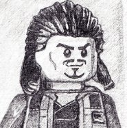
Seneca Crane's Beard
in Blogarithm
A blog by Sumiki in General
Posted
That beard is the definition of all that is right and just.
Just saying.
~Soran