

Axilus Prime
-
Posts
5,555 -
Joined
-
Last visited
Content Type
Profiles
Forums
Gallery
Events
Blogs
Store
Raffles
Everything posted by Axilus Prime
-
 It's because of size. Look at the pictures, you can tell which ones are bigger.
 -
WELL then. Guess I'm only getting one Toa, at most! But then, I figured that might happen anyway. Tahu. Must buy you. Eventually.
-
LOL. These are all pretty funny. The muffin one was the best, it actually did make me laugh IRL.
-
Nice! The characters themselves look cool, all somewhat unique but clearly members of the same "set wave", if they were released that way. The photo editing is downright amazing, it adds perfect atmosphere. You should be doing promo art at Lego, I'd say you do it better than some of what they do.
-
Yes. Let's return to proper Bionicle, however small, being released at MCD. Not those silly rubber figurines that you can't build or do much of anything with.
-
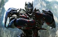
These designs are awesome! Story looks decent so far too, we'll have to see where it goes. But if nothing else, I love the look of these sets! Hope Tahu isn't too expensive, I want to buy one. The dual-function weapons are back, and that is great. Never guessed Gali's fins would become a huge axe. Kopaka's dual sword becoming skates is predictable but good. I was quite surprised to see Lewa Nuva's flight style incorporated into Lewa '15. Onua's dual function is somewhat less impressive, but it makes sense for him. Pohatu's is quite cool, him riding a tornado makes sense now. Tahu's is perfect. I thought those little swords he had while riding on his lavaboard looked a bit small, but it seems if he needs something bigger, he's got it! And it's a Lhikan callback. What's not to like?
-
KIKANALO TRAILER (BIONICLE Fan Film)
Axilus Prime replied to MetruNuiLegacy's topic in Fan Created Media
That looks great. The movements are smooth and well done, for a stopmotion. The effects are downright awesome. Did Lhikan's entrance intentionally mirror Vakama stepping between the Matoran and the Bordakh in that Metru Nui animation? -
Oh wow. Thanks for putting so much time and effort into it! As I've said before, looks great. Everyone tilting their heads the same way was pretty funny for some reason. Much improved fight scenes, I see you took my suggestion of doing them move by move. The Hau effect in particular was very well done. "Now, go socialize." For some reason that line was funny too. Nice shotgun! Oh, but I do have a minor gripe. Axilus' speech patterns wouldn't really be like that. If you've read Prototypes, that's something to go off of in that regard. For more specific examples, I'll give adaptations of how I think he'd have delivered his lines in this comic. Quite the welcome, eh, Iron Man? --> We've received quite the welcome! Get off me, little man. --> Get off me! These guys are obnoxious! --> Obnoxious piece of tin! (With an optional "HRRAH!" as he throws him off) And stay off! --> Stay down! A few changes are just slight, but I think you can glean his general manner of speaking from this. So if you could write his future lines more like that, that'd be great. Oh, and Cyborg Tahu looks great. He genuinely looks like a cyborg, which is quite a feat on your part considering all Bionicle characters look robotic to begin with.
-
Kiina and Zesk. The Stars are all horrible and Morak has a Soldified Air Launcher...which is prone to dropping its ammo. Kiina and Zesk aren't anything special either, but they're the best options here.
-
Well, some of you may be familiar with my Optimus Prime drawing. Those of you who are suggested that I draw Grimlock next. So, here he is! As always, comments much appreciated!
-
Both your Matoro drawings look extremely feminine for some reason. I think their features are too smooth and curved. The faces are also very feminine. What's the green flame stuff on that side of his head? As for the sword, definitely seeing a Kirito influence there, lol. Looks like it's actually made of ice though.
-
Everything is Mata-Nui's fault
Axilus Prime replied to Toa Chuck's topic in Bionicle Storyline & Theories
Couldn't have said it better myself. -
This needs to be a thing. The whole thing reminds me a lot of Fall of Cybertron, with the loading screen and gameplay setup. That's a good thing.
-
What Bionicle products would you like to see return?
Axilus Prime replied to MeetTheName's topic in Bionicle Discussion
Movies, if they are good. -
I don't want any existing characters to change gender. It'd be weird. I do want to see a less skewed gender ratio with new characters though.
-
Yeah, I know that was pretty big, but I meant it. It's so true to the feel of Bionicle that I was astounded. There isn't anything else on here like this, that much I can say for sure.
-
Bionicle 2015 Jaller Polybag concept
Axilus Prime replied to Toa Chuck's topic in Bionicle-Based Creations
They're pretty good starts, but the one on the left has a torso much too large. Looks impossible for him not to waddle. The one on the right looks much better and easily evokes the old Matoran look. But maybe you should give him symmetrical hands, since without Kanoka, the point of a special hand piece is nonexistent. It just makes him look like "Matoran Hordika Jaller" with that clawed hand. -
You've got a lot of creative things going on here. The Desert Sedge is by far the best one, with the solidity of design, good color scheme, and the double Rahkshi head as the upper head. The other two are good by design, but their color schemes are... horrible. Nice work, though I suggest color improvements in the first two...which probably means disassemble them entirely, pick a new color scheme, and replace every piece in a color that doesn't work with that scheme, with a piece that does.
-
Awesome, I showed up in full! And the design you made is awesome. The new villains definitely look villainous. Acetous does pull off the corrupted look. The Fire Sprite looks like a mean little critter that will jump on your head and rip your eyes out...which, I suppose, is what it's meant to look like. wait a minute the toa nuva are separate but the kaita mata were combined and were in last comic and tahu was captured wuzzgoinon here That aside (though I'd appreciate an answer ) Tahu definitely looks severely mutated even with just that partial view. Looking forward to seeing what happened to him in full!
-
Ok, I just read that, and I am happy to say that was excellent improvement. Much more dynamic, and things actually did get somewhere. The cliffhanger was well done this time, since it points to the continuation of a larger scene, rather than scene change after scene change. The effects are impressive for a Paint comic too. They show a new degree of effort that the previous comics lacked.
-
The hose actually would help with making it look less organic, unless you have problems drawing ridged hoses. (I know, they're tedious.)
-
This stuff's actually good, with the exception of the Elda. I don't like the way you redesigned that one. Also, I think the Sanok was good in gray. The rest is great, Sanok shape included, and the Calix's eyeholes are awesome.
-
It's a little fuzzy. At least I can recognize the Kaukau. I encourage you to keep drawing!
-
Awesome! Definitely got pleasantly surprised to see this today. I see Akamai and Wairuha are revamped. Wasn't expecting that, but they look good. And the practical effects have noticeably improved. Did you actually spray paint your carpet, and set a part of your yard on fire? The ending...
